2013 is bringing the Retina MacBook Pro to the mainstream.
Well, as mainstream as high-end Macs can be, anyway. When the first Retina MacBook Pro was released back in 2012, it came with great hardware and a beautiful screen, but only Apple's applications had been upgraded to really take advantage of it. It was also very expensive—it started at $2,199—and the non-Retina versions were refreshed with the same CPUs and GPUs and sold for a much lower price. It was an attractive notebook, but it was an early adopter's trinket that came with as many caveats as virtues.
Fast forward 16 months. Third-party developers have had time to update their applications. The cost has come down to a still-high-but-not-for-a-MacBook-Pro starting price of $1,999. And, of course, the 15-inch non-Retina Pro has been dropped from the lineup, survived by its awkward, un-refreshed, smaller counterpart. If you're looking for a 15-inch MacBook Pro, the Retina version is now a more appealing option, but it's also your only option. Let's take a look at how it stacks up.
Body, build quality, and Thunderbolt 2
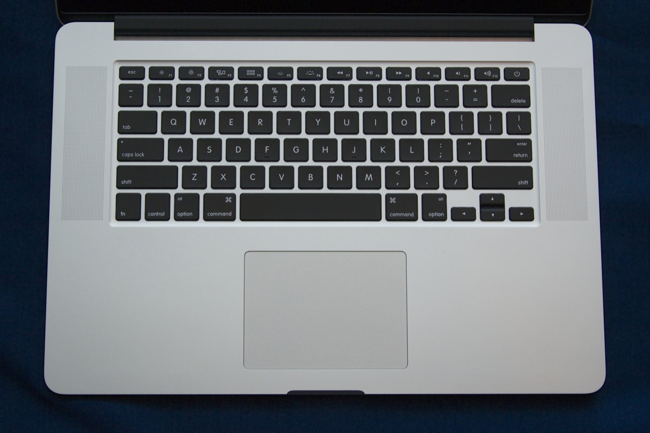
The short version: The design, size, and weight of the 15-inch Retina MacBook Pro are virtually unchanged from last year. It takes some cues from the MacBook Air, but Apple's largest laptop has more in common with the MacBook Pros of yore than with the Airs. Thunderbolt 2 is the only interface upgrade.
The long version: While the 13-inch model has been made a little thinner and a little lighter than it was in 2012, the chassis of the 15-inch Retina MacBook Pro is identical to its predecessor. Our notes about the 2012 model's design are still applicable now, but since it's far more likely that you'll be coming to the Retina MacBook Pro from an older, non-Retina version, we'll go over it again in brief.
All of Apple's laptops share the same broad strokes: backlit Apple logo on the lid, aluminum unibody construction, a nice stiff hinge, backlit chiclet keyboards with reasonable key travel, and big, accurate, responsive multitouch trackpads. Apple has been selling MacBook Pros that fit this description for the better part of five years.
The Retina MacBook Pro fits in the same mold, but it's infused with just a hint of MacBook Air. It loses the optical drive and the user-serviceable parts that older Pros used to have, but it gets just a little thinner and lighter and moves to all solid-state storage. It has a pound-and-a-half of weight on the largest MacBook Air and you'll feel that difference in your bag, but it's not some monstrous barely-mobile workstation either.
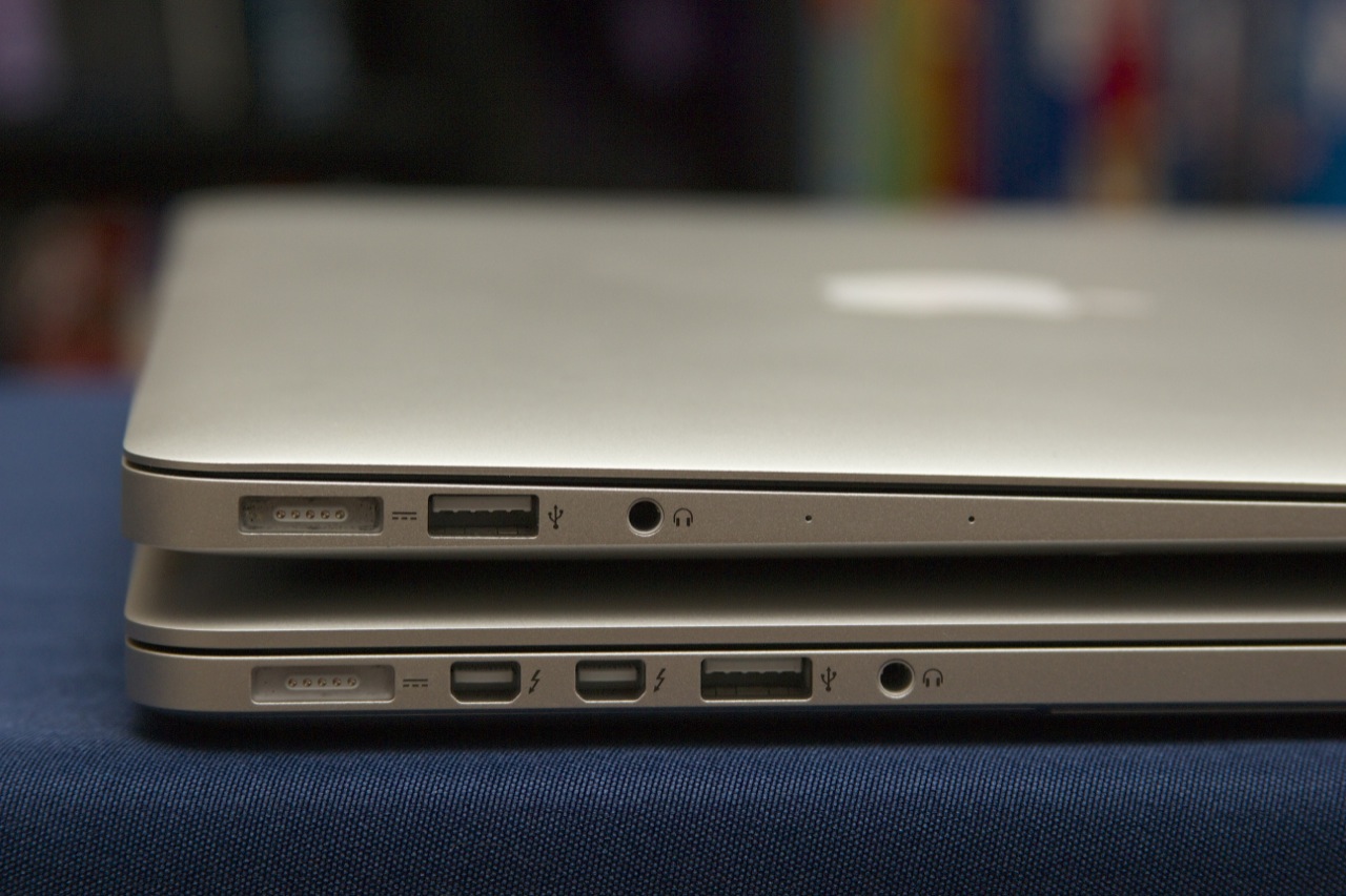
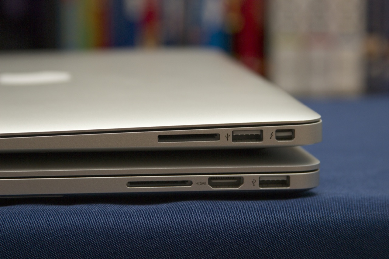
Like the Airs, the Retina MacBook Pro has given up its wired Ethernet port, but it comes with a few others to help earn it that "Pro" label. In addition to two USB 3.0 ports, an SD card reader, and a combination headphone/input jack, it includes a full-size HDMI port and two Thunderbolt ports that power users can count on to get their wired Ethernet and FireWire ports back if they really need them.
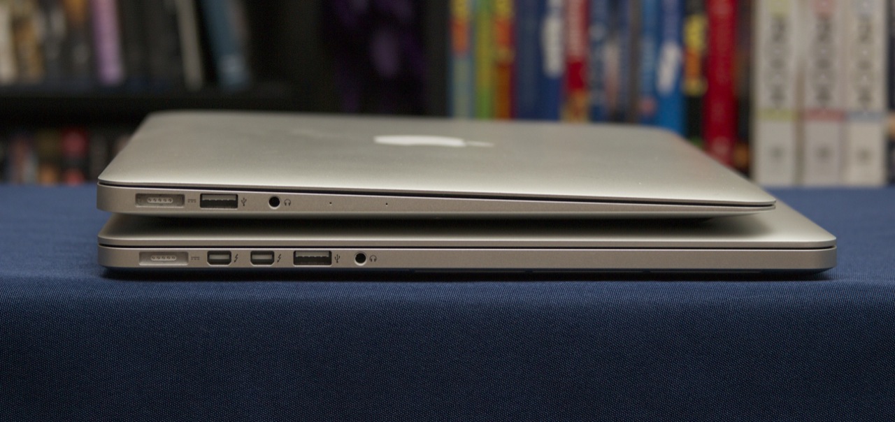
Those two ports have been upgraded to Thunderbolt 2 courtesy of Intel's DSL5520 controller, and this is the first shipping Mac that uses the new version of the high-speed interface. Each Thunderbolt port has access to two Thunderbolt channels and is capable of data transfers at theoretical speeds up to 20Gbps (or 10Gbps per channel).
The original Thunderbolt used two 10Gbps channels too, but data could only move in one direction on either lane; if you were downloading data at the rate of 10Gbps but not uploading anything, the second channel would sit completely unused. Thunderbolt 2 adds "channel aggregation," which allows both channels to be used simultaneously to transmit data in the same direction. Thunderbolt 2 additionally adds support for the DisplayPort 1.2 spec, which is necessary to support 4K output, though according to Apple's spec sheet each Thunderbolt port can only support a single 2560×1600 display at once (for a total of three displays, including the laptop's). The Retina MacBook Pro provides 4K video output through HDMI—that port supports 3840×2160 displays at 30Hz and 4096×2160 displays at 24Hz.
Because the total amount of bandwidth hasn't changed, all existing Thunderbolt cables should all be able to run at full Thunderbolt 2 speeds when connected to supported computers and accessories. Actually testing Thunderbolt 2 is a bit out of our hands at the moment since no accessories exist that actually use the standard—the original Thunderbolt hasn't proven to be very popular aside from in Mac accessories and the odd dock or external hard drive—but 4K display support at least is a tangible feature benefit that video and photo professionals will appreciate as the standard becomes more widespread.
The screen: Better with time (and apps)
The short version: It's the same 2880×1800 screen, but third-party applications actually take advantage of it now.
The long version: The Retina MacBook Pro's 15.4-inch 2880×1800 screen is no longer unique. The Chromebook Pixel and an increasing flow of Windows PCs are all beginning to ship with screens in the same density range, and most of them share the Pro's great viewing angles, good contrast, excellent brightness, and vibrant color. The panel itself is only part of the story, though.
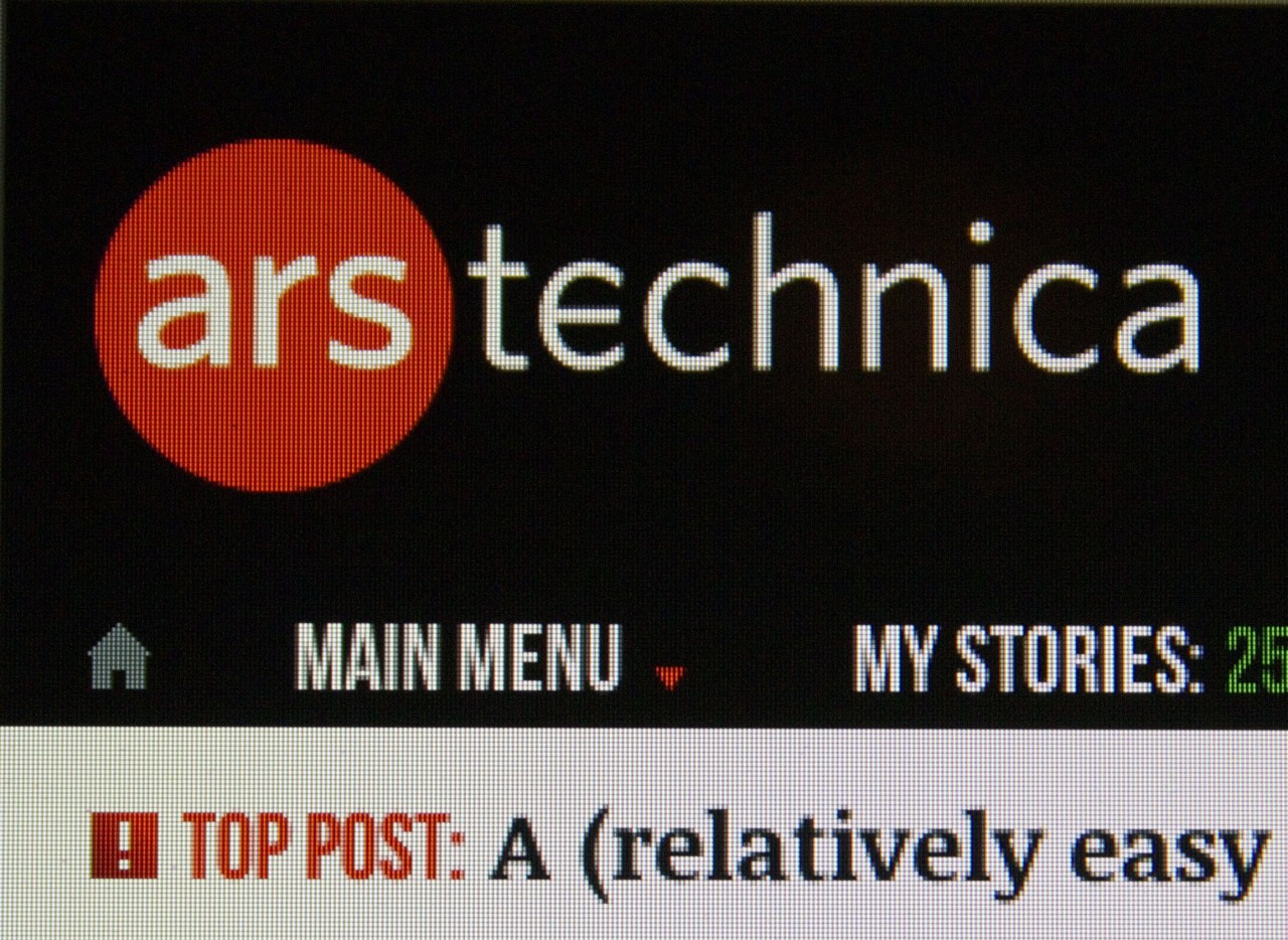
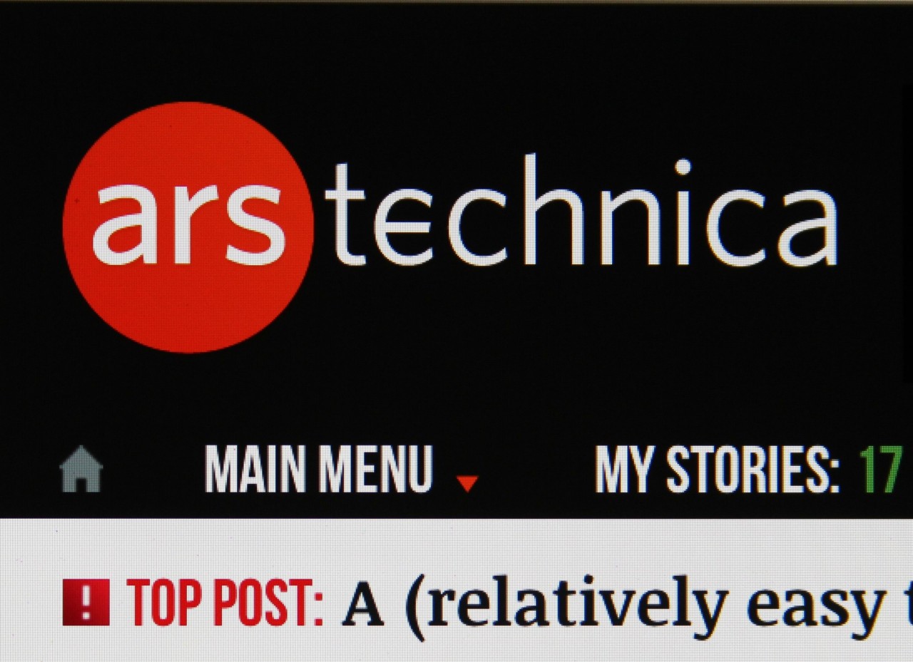
When Apple's other product lines went Retina, there was a transition period for third-party applications as their developers updated them with scaled-up assets. Non-Retina Macs have been around for much longer than non-Retina iPhones or iPads, though, and of Apple's entire Mac lineup only the 13- and 15-inch Pros include the screen at all. You can reasonably expect to use an iPhone or iPad these days without ever running into a non-Retina app, but it still happens with some frequency in OS X.
That said, the people who held off on a Retina MacBook Pro last summer to buy one now will be rewarded for waiting: in the last year-and-a-half, most major applications have gained support for the feature. Most of the programs I use in a normal day—Apple's built-in apps (no surprise), Microsoft Office (mostly, with the exception of a few icons and dialog boxes), Chrome and Firefox, Tweetbot, Scrivener, and the Limechat IRC client—have all been more-or-less optimized for the high-density screens. Audacity is the only one that remains totally non-Retina, and this is a more common occurrence the further you move away from the beaten path (doubly so for applications that aren't in active development).
The biggest problem at this point is actually the Web itself. Having Chrome, Firefox, and Safari Retina-optimized means that text looks smooth and sharp regardless of the browser you're using, but most sites still use lower-resolution images that look soft and vaguely blurry on a Retina screen. This situation should continue to improve now that high-density displays are proliferating in Windows laptops and Web standards are catching up, but for now browsing is still the least consistent thing about using a Retina Mac.
No comments:
Post a Comment